
Introduction:
But let’s get honest with ourselves: most FAQ pages are an absolute joke. You know the ones I’m talking about: the forgotten links at the very bottom of your footer that have clearly not been touched since 2012. Most often, they’re just a block of text nobody wants to read. But the reality is this: if you’re running a business in 2026, you simply can’t afford to treat your help center like some sort of digital junk drawer. Not only is a good FAQ page not just about “answering questions,” but it’s also an absolutely massive psychological play that closes sales and, more importantly, is a veritable goldmine for your search engine rankings. When you think about how people search now, they don’t just type in keywords with two words. They ask full questions. “How do I?” “What if?” “Is [Product A] better than [Product B]?” If you don’t have an easy way to answer these types of questions on your website, then you’re essentially giving that traffic away to some competitor who does. Which is why any legitimate SEO Agency worth its salt is going to tell you that a good FAQ page is one of the most underrated SEO Services.
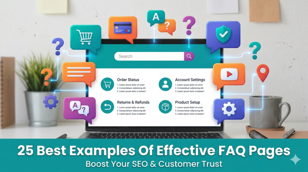
So, in this deep dive, inspired by some of the most effective designs out there, we’re going to explore 25 examples of FAQ pages that actually get it right. We’re moving away from the “boring list of links” and moving toward interactive, user-focused experiences that make people feel like you actually give a damn about their time.
Why the FAQ Page is Your Secret Weapon in 2026
Before we get into the list, let’s discuss the importance of the FAQ page and why this is significant. In today’s environment, Search Generative Experience (SGE) and AI-based search are trying to find direct and authoritative answers. By setting up the FAQ page correctly, you’re literally giving the search engines exactly what they’re looking for on a silver platter.
A well-constructed FAQ page does three things:
- Reduces Friction: It eliminates the “but what if?” scenarios that cause people not to click the ‘buy’ button.
- Saves Your Support Team Time: By having the answer available on your website, people will not flood your live chat or email with the question.
- Boosts Search Visibility: By using “Schema Markup” (which a professional SEO Agency will handle for you), the questions can actually appear directly in the Google search results page, taking up more “digital real estate.”
- Microsoft (The Modern Navigation)
Microsoft’s FAQ is not just a page; it’s a search-first hub. They know their product suite is massive, so they’re not going to make you scroll. They’re going to give you a massive search bar and organize everything by product icon. It’s clean, it’s fast, and it’s a tool, not a document.
- WhatsApp (The Simplicity King)
WhatsApp makes it incredibly “human.” They use short, punchy sentences and large, easy-to-tap buttons for their mobile users. Since most of their users use a phone, they’re designing for thumb-friendly navigation.
- McDonald’s (The Transparency Play)
McDonald’s uses their FAQ to answer the tough questions, like what’s really in their nuggets. By being bold and answering these myths head-on, they’re building trust. This is a great example of using a FAQ for brand reputation management.
- Airbnb (Personalized Help)
Airbnb’s FAQ page is a genius concept because it’s different for “Guest” vs. “Host.” It filters out the noise so that only the relevant information appears to the user. This is a “dynamic” user experience that is a top-tier feature that is usually recommended in high-end SEO Services.
- Etsy (The Community Feel)
Etsy’s got a great concept for their FAQ page: “Buying” vs. “Selling.” But they also have a section for their community forums. It’s like the user is part of a larger ecosystem.
- Nintendo (The Visual Guide)
Nintendo’s audience is comprised of kids and parents. They’re heavy on screenshots and diagrams. If you’re trying to explain to someone how to fix a Joy-Con on a Switch, a picture is worth a thousand words of technical jargon.
- Pinterest (The Clean Aesthetic)
The FAQ section of Pinterest looks exactly like Pinterest. The branding is seamless. This is a huge tip: do not let your FAQ page look like it comes from a different company. Make it consistent with your branding. Use the same fonts, colors, and general aesthetic.
- YouTube (The Video-First Approach)
Unsurprisingly, YouTube makes use of video tutorials for their FAQ. Why not use video tutorials for your product? If it’s a visual or complex product, a 30-second video can answer a customer’s question way quicker than a 10-paragraph essay.
- Adobe (The Deep Dive)
Adobe has complex products. Their FAQ page shows this because they offer a “Learning & Support” tier. You get the basic answer first, but you can always click on the link to the “Deep Dive” guide if you need to get down and dirty.
- Amazon (The Logic Flow)
Amazon’s FAQ page is based on “Recent Orders.” They’re able to predict what you’re going to ask based on your recent orders. “Where is my package?” is usually the #1 question, so that’s right at the top.
- Zappos (The “Above and Beyond” Style)
Zappos is the king of customer service. They have their 24/7 phone number listed on every single sub-page of their FAQ page. It says, “We want to help you, even if it means talking to a human.”
- Spotify (The “Top Questions” Sidebar)
Spotify has a “Trending Now” section on their FAQ page. If there’s a widespread technical issue going on, they’ll have the answer right at the top of the page so you don’t have to go searching.
- Twitter / X (The Minimalist)
X has a very high-contrast design. It’s very simple. It’s no distraction. It’s just the questions and the answers.
- Dropbox (The Interactive Search)
As you type in the Dropbox help bar, it suggests articles in real-time. This is an example of “predictive” search, helping you find answers even before you finish typing in your question.
- FatFace (The Visual Branding)
This clothing company uses lifestyle images in their FAQ page. It does not feel like a “boring” legal document; it feels like part of the shopping experience.
- National Geographic (The Educational Tone)
National Geographic’s FAQs feel like their magazine articles—informative, authoritative, and even curious. It is true to their brand tone.
- Nike (The Directness)
Nike’s FAQ page is very “Just Do It.” Quick answers about shipping, returns, and sizing. No fluff.
- UPS (The Utility Hub)
UPS is all about tools. Their FAQ page is surrounded by tracking bars and shipping calculators. It is an “action-oriented” page.
- IKEA (The Visual Troubleshooting)
IKEA uses their famous line drawings to help you understand assembly problems. It is consistent with the instructions you receive in a box.
- Booking.com (The Reassurance Focus)
Their FAQ page has a strong focus on “Free Cancellation” and “Safety.” It’s intended to assuage the concerns of someone about to spend thousands of dollars on a vacation.
- Headspace (The Calm Design)
Their FAQ page is even “Zen.” It has lots of white space, soothing colors, and language. It perfectly matches their product’s mission.
- Trello (The Card System)
Trello uses their own “Board” system to organize their FAQs. It’s genius. They’re showing off their product while being useful.
- Hulu (The Device-Specific Filter)
Hulu allows you to filter their FAQs by “Device.” This is useful if you’re having an issue with your Roku. You don’t want to read about fixes for your PlayStation.
- Shopify (The Entrepreneur’s Guide)
Shopify’s FAQ page is like getting free advice on E-commerce. They’re not just answering technical questions, but also providing advice on how to succeed.
- Canva (The Design-First Help)
Canva uses beautiful, simple icons to categorize questions. It’s proof that help pages don’t have to be ugly.
How to Build Your Own “Effective” FAQ Page
If you’re looking at these 25 examples and getting a little overwhelmed, don’t worry. You don’t need a million-dollar budget to make this work. You just need to follow a few “human” rules:
Stop using Jargon: Write like you’re talking to a friend. If your FAQ page sounds like it was written by a lawyer, people will not read it.
Use Search Data: Take a look at what people are actually searching for on your site. If 50 people a day are asking your return policy, that should probably be the first question on your page.
Make it Scannable: Make it easy to read. Nobody actually reads an FAQ page. They just scan it until they find what they need.
Update Often: There’s nothing worse than an FAQ page that mentions a sale from 2024.
The SEO Connection: Why it Matters for Your Bottom Line
From a technical standpoint, your FAQ page is one of the easiest ways to win “Featured Snippets” on Google. When someone asks a question and your site provides a clear, 2-3 sentence answer, Google often puts that answer right at the top of the search results in a little box.
This is where working with a professional SEO Agency pays off. They can help you implement “FAQ Schema,” which is a bit of code that tells Google, “Hey, this is a question, and this is the answer.” It makes your listing look bigger and more trustworthy than everyone else’s. If you aren’t sure how to do this, looking into comprehensive SEO Services is usually the best move to ensure the “back-end” of your site is as good as the “front-end.”
Final Thoughts: Give Your FAQ Some Love
At the end of the day, your FAQ section is a reflection of the way you treat your customers. If you have a messy, hard-to-navigate FAQ section, you’re essentially telling your customers that you don’t really care about their experience after you’ve taken their money. On the other hand, if you have a clean, well-designed, and maybe even fun-to-use FAQ section, you can build an enormous amount of brand loyalty.
Take a look at your current help section today. Does it look like something on that list of 25? Or does it look like a “wall of text” from the early 2000s? If the latter is true, maybe it’s time for a redesign. Your customers – and your Google rankings – will thank you for it.


Rahul M.
B2B Service Provider