
Adobe Experience Manager Sites makes it easy to create your own websites for both desktop and mobile experiences. But before you start building your website, you need a clear website design agency to guide the process. This tutorial walks you through each step—from defining the purpose of your website and understanding your target audience, to choosing the right platform, shaping your design, and creating effective wireframes.
In this guide, you will learn how to:
- Define your website’s purpose and goals.
- Identify your target audience and understand their needs.
- Choose the right platform to build your site.
- Plan your site’s structure and layout with a sitemap.
- Outline key page types and create wireframes for each.
- Prepare your content — copy, visuals, graphics, and media.
- Design the structural and visual elements that shape your website’s UX.
- Review your site for accessibility and inclusivity.
- Test, refine, and launch your website.
- Monitor performance with analytics and continue improving.
Choose a Website Platform to Build your Website.
Website builders and content management systems (CMS) make it easy to design, customize and publish your website. These platforms offer pre-built templates, drag-and-drop editors, and ready-made components that speed up development—helping you get started faster without requiring advanced coding skills.
Select the right platform or CMS
Choosing the right website platform or content management system (CMS) is one of the most important decisions you’ll make during the design process. The platform you select will influence how easily you can build, maintain, and scale your site over time. Evaluate each option based on usability, customization capabilities, performance, cost, and long-term growth potential.
Features to look for in a website builder
When selecting a platform to build your site, consider whether it offers:
- Fast site creation for quick setup and deployment
- Ease of use across both mobile and desktop devices
- Fast page load speeds for a smoother user experience
- A powerful content management system that supports a shared environment for your team
- Content insights and analytics to guide improvements
- Project workflows for organizing and streamlining tasks
- Budget-friendly pricing, whether you’re building a simple site or a large one
- Versatility, allowing for customizations, integrations, and scalability
Decide what your website is for—and what you want it to achieve.
First things first, you really have to be clear why you’re building a website. You understand your goals and users, so it guarantees that the design reflects what will really satisfy the needs of the users.
Start with identifying the primary objective for which you have created a website.
Are you a retailer looking for new customers?
Are you a nonprofit looking for a way to circulate resources and raise awareness?
Do you want to publish content, generate leads or organize events?
Some websites have more than one function and that’s okay. If this is the case, you can create different pages or sections for each goal you have in mind.
- Common examples of sites include:
- e-commerce sites
- Event sites
- Websites for non-profit organizations
- Travel and tourism websites
Business or corporate websites
News and media websites
Once you understand what kind of website you’re building-and what the objectives are that lie behind it-you can begin to build the structure and visual design of your website.
Define the Target Audience of your Website and the Need They Have.
Besides being designed to serve a purpose, your website depends, to a great degree, on what your target audience will be. Knowing who your visitors are has a lot of advantages. This allows you to craft messages, images, and user journeys for the people you want to reach and guide them onto the right actions. Understanding their pain points, motivations, and concerns lets you create content which solves their problems and helps build trust. When your website speaks directly to the needs of your audience, you build and nurture relationships, foster deeper engagement, and assure long-term loyalty and advocacy.
Website builder platforms to consider
Here’s a quick look at some of the top website-building platforms and their strengths:
WordPress
Extremely flexible and widely used. It’s beginner-friendly for basic sites, but more advanced features may require developer support.
Wix
Known for its user-friendly interface, template library, built-in SEO tools, and responsive customer support.
Squarespace
A top choice for creatives thanks to its polished, award-winning templates and streamlined design tools.
Adobe Creative Cloud
Adobe Express offers a free, simple website builder ideal for creating quick one-page sites.
(Example: Deloitte used Adobe Creative Cloud to deliver high-impact content.)
Shopify
Designed for ecommerce sites, with extensive sales features, multi-channel support, and strong inventory management tools.
Adobe Commerce
Built for sophisticated ecommerce experiences using AI and Adobe ecosystem integrations.
Its drag-and-drop interface is intuitive, and it supports multiple brands, channels, and regions. (Example: Coca-Cola achieved higher revenue and conversions with Adobe Commerce.)
Plan the Structure and Design of your Website
A clear and strategic website structure is essential for good user experience and SEO. Well-organised navigation helps visitors find information quickly, reduces frustration, and ensures that search engines can index your pages correctly. Before designing, determine how your content will be organized and how users will move around the site.
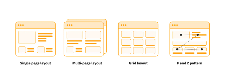
Single page layout
A single page layout keeps all your content on one long, scrollable page instead of spread across multiple sections. This format works best for websites with limited information, where simplicity and quick navigation are important.
Multipage structure
A multi-page website is the most common structure on the web. It usually consists of a home page that is divided into other pages through menus and internal links. This format is ideal for websites with a lot of information or multiple goals, allowing you to organize content clearly and intuitively.
Grid-based design
A structured grid layout helps users intuitively scan content and interact with your site more naturally. Grids promote consistency across devices, maintaining a clean, balanced look on different screen sizes.
F-pattern and Z-pattern layout
Eye-tracking studies show that users often scan web pages according to an F- or Z-shaped pattern. Content designers use this understanding to direct attention—placing key elements where users see them naturally and structuring content to encourage deep reading rather than quick skimming.
Ultimately, the design of your website should reflect your goals and highlight key information quickly. Here’s how layout options can vary by site type:
Online store:
Home pages often contain personalized product recommendations (like Amazon) or a curated mix of products and editorial content (like Nike).
Portfolio Sites:
Creative professionals use portfolio websites to showcase work. Photographers can offer photo galleries, while agencies often mix photos with case studies.
Company Websites:
These sites prioritize clear value communication and strong call-to-action to drive purchases, demo requests, or lead submissions.
Event page:
Event pages should prioritize the most important details – date, location, schedule, speakers and registration options.
Blog: The blog should help users easily find fresh, trending and relevant posts while clearly explaining the purpose of the site to new visitors.
Define Page Types and Create Wireframes
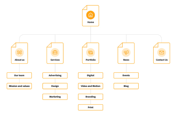
Next, outline each page you need for your website. This can be a simple list or a visual sitemap that shows how the pages are connected. Mapping your site ensures that no important content is missed and helps align each page with your overall goals.
Once your page list is complete, you can start developing wireframes – basic low-quality layouts that outline the structure of each page. Wireframes help you decide where content, navigation, and key design elements should go before moving on to the full visual design.
Start with Important Pages
Start with a website that clearly links to other important pages. Include a contact page so visitors can easily reach you. Depending on the purpose of your site, you can also add an FAQ page or a creative 404 error page. The pages you include should reflect your website goals.
Pages that almost every website needs:
- Home Page: Arguably the most important page, your home page should include a prominent call to action (CTA) to drive user engagement.
- About: Share your company’s mission, history, team and unique value proposition.
- Contact: Give visitors ways to contact your team or customer support.
- Product pages: Provide detailed information about individual products or services.
- Blog: Display a list or grid of your most recent articles to keep your content fresh.
- FAQ: Address frequently asked questions to reduce repetitive inquiries and improve the user experience.
Create and Collect Content on the Website
Once your structure is ready, start adding content: text, images, logos, videos and graphics.
Tips for creating content:
- Give each page a clear purpose: align the content with what the visitor is looking for.
- Use simple, concise language: Avoid jargon and write in a way that is easy to understand.
- Break up text: Use headings, bullet points and sections for easy readability.
- Stay consistent with your brand: Use your brand’s voice, guidelines and visual style on all pages.
- Use high-quality graphics: Original images or professional stock images increase credibility and engagement.
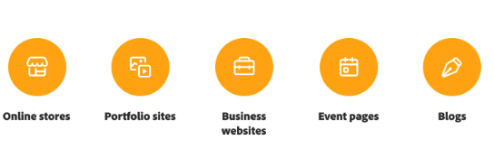
Content examples by website type:
- Online stores: High-quality product images and detailed descriptions are crucial.
- Portfolio sites: Combine visual media with textual content to showcase work effectively.
- Business websites: Include testimonials, case studies, product details, and blogs.
- Event pages: Highlight event details, galleries, and promotional graphics.
- Blogs: Mix text with images, videos, animations, and infographics.
Design Structural and Visual Elements for UX
To create a positive user experience, consider:
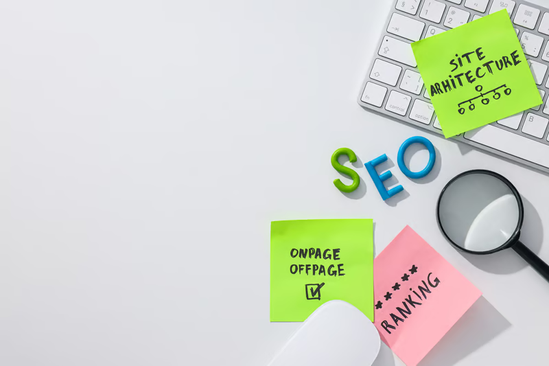
- Site architecture: Organize pages intuitively so visitors can find key information quickly.
- Navigation menu: Include links to the most important pages, grouped logically, and ensure it is responsive across devices.
- Colors: Use a harmonious palette—primary (60%), secondary (30%), and tertiary (10%).
- Fonts: Choose legible fonts consistent with your brand.
- Header and footer: Header should display the logo and key navigation, while the footer can include contact info, social media links, and a CTA.
- Motion and animation: Use sparingly to maintain speed and prevent distraction.
Visual design directly impacts user perception—clean, consistent designs convey professionalism, while cluttered sites may drive users away.
Review for accessibility
Ensure your website is usable for all visitors, including those with disabilities:
- Navigation: Make sure keyboard-only users can navigate easily.
- Screen readers: Use proper heading structures and alt text for images.
- Color and contrast: Ensure text is legible against backgrounds and avoid relying solely on color to convey information.
- Moving content: Provide controls to pause or stop animations, videos, or flashing content.
Test and launch
Before launching, thoroughly test your site for:
- Functionality: Check links, buttons, menus, and forms.
- Mobile responsiveness: Ensure your site works well on all devices.
- Speed and performance: Use tools like Google PageSpeed Insights to check loading times.
- A/B testing: Trial variations of layout, images, or copy to see what works best.
- Usability testing: Monitor user interactions to identify pain points before full launch.
Monitor performance and iterate
After your site goes live:
- Track analytics: Use built-in tools or Google Analytics to monitor page views, engagement, conversions, and bounce rates.
- Refresh content and design: Regularly update images, keywords, and page structure.
- Maintain usability: Check loading times, fix broken links, and remove outdated content.
Ongoing monitoring and updates ensure your website remains relevant, functional, and engaging for visitors.
Getting started
With this guide, you’re ready to start designing your website. Take inspiration from successful sites but let your creativity shine.
Adobe Experience Manager Sites lets you create and manage websites efficiently. Build personalized experiences for multiple channels, customize templates, and update content from a single platform—all designed to keep your audience engaged.
Learn more about how Experience Manager can help you build and manage your business website effectively.


One Response