

More than half of all global website traffic now comes from mobile devices . So, your mobile website isn’t just some add on to your desktop experience anymore— it’s basically the main version that both customers and search engines end up judging. No matter if someone is browsing your products , entering details in a contact form , or going through checkout, how things work on their phone will directly shape your business growth.
A mobile website audit helps uncover what’s holding you back with search rankings , page speed , general usability, and yes, conversions too. It looks at the whole mobile journey, covering technical SEO and Core Web Vitals , plus things like menu flow, what content is actually visible, and how smooth your lead generation paths are.
At Bloom Agency, we run thorough mobile website audits that mix technical SEO, website development, UX analysis, and conversion optimization. Instead of only listing problems, our team provides practical steps and concrete recommendations so businesses can strengthen rankings, sharpen user experience, and drive more revenue .
Why a Mobile Website Audit Really Matters
Google mostly looks at the mobile version of your website when it is deciding search rank. If your mobile pages have missing material, slow-loading resources, navigation that breaks , or a weak user experience, then your rankings can drop, and your conversions may fall too, like quite fast sometimes.
A solid mobile audit covers four key perspectives, not just one thing:
- How people experience the website day to day
- How search engines crawl and index pages
- How analytics tools record user behaviour
- How well pages move visitors toward becoming customers
When these four areas work together, businesses usually see better visibility, stronger engagement, and more revenue.
Key Areas Every Mobile Website Audit Should Cover
Mobile Indexing
Confirm search engines can crawl and index the important pages without being blocked. Review robots directives, canonical tags, XML sitemaps, redirects, and also rendering issues, because these can quietly block visibility even when the site looks fine to you.
Content Consistency
Your mobile site should offer the same helpful content as the desktop version. Things like headings, internal links, images, metadata, structured data, FAQs, and key service details should stay available and not be “missing” behind some layout trick.
Website Speed
Loading speed stays one of the most significant ranking and user experience signals. So every audit should examine, even if it seems small:
- Largest Contentful Paint (LCP)
- Interaction to Next Paint (INP)
- Cumulative Layout Shift (CLS)
- Server response time
- Image optimization
- JavaScript performance
- Third party scripts
Mobile User Experience
Visitors should be able to browse without feeling stuck or annoyed. Navigation, menus, forms, buttons, filters, and checkout flows must run smoothly across different screen sizes and not behave weirdly when they scroll.
Conversion Tracking
The audit should also check that your important user actions are tracked properly in analytics. That includes phone calls, enquiry forms, purchases, bookings, and newsletter subscriptions. If tracking is off , you might think everything is failing when it is not, or the other way around.
Mobile Website Audit Checklist
Before diving into technical improvements, every business should review the following checklist.
| Priority | Audit Area | Goal |
| High | Crawl mobile pages | Ensure pages are crawlable and indexable |
| High | Compare desktop and mobile content | Maintain complete content parity |
| High | Review Google Search Console | Confirm indexing and search performance |
| High | Test PageSpeed Insights | Identify loading bottlenecks |
| High | Measure Core Web Vitals | Improve user experience signals |
| Medium | Test real mobile devices | Validate navigation and usability |
| Medium | Verify analytics | Ensure conversion tracking is accurate |
Step 1: Crawl Your Mobile Website
The first step is kinda figuring out exactly what search engines see when they visit your website, on a mobile browser of course.
A mobile crawl surfaces technical problems that can hurt visibility, like redirect chains, broken pages, duplicate URLs, missing metadata, blocked resources, and even incorrect canonical tags, yes those too.
During this stage businesses should make sure that
- Important pages return a 200 status code
- Canonical tags point to the correct URL
- CSS and JavaScript files are actually accessible
- Images and fonts load properly (not just “kinda”)
- Internal links stay working
- Navigation is crawlable
Spotting these issues early means search engines are less likely to index some incomplete, or just wrong, version of your site.
Step 2: Verify Mobile Content Consistency
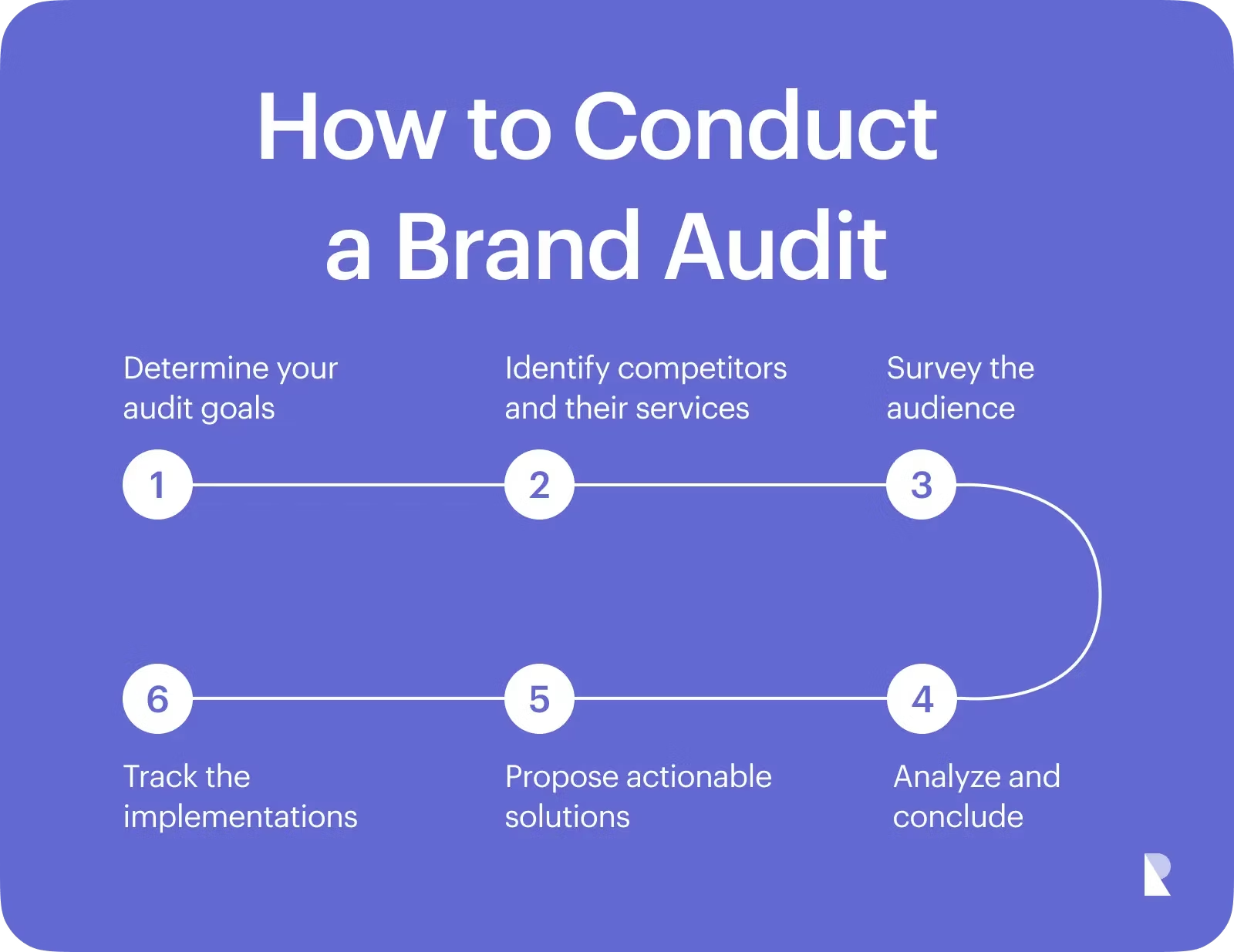
A lot of businesses accidentally remove useful content from mobile pages just to keep the layout simpler. A cleaner design can help readability, but hiding key info can quietly lower SEO performance.
Compare the desktop and mobile pages carefully and double check:
- Primary headings stay the same
- Service descriptions are fully visible
- Product information is complete
- Internal links remain accessible
- Images still include descriptive alt text
- FAQs don’t disappear
- Structured data matches what users can actually see
Keeping everything consistent helps search engines understand your pages while users get the info they came for.
Step 3: Review Mobile SEO Performance
Technical audits get way more useful when they’re paired with real search data.
Check your mobile performance in Google Search Console, so you can see which pages are losing impressions, dropping in rankings, or running into indexing problems.
Focus on things like:
- Declining mobile traffic
- Pages with lower click through rates
- Indexing errors
- Canonical conflicts
- Structured data warnings
- Coverage reports
- Mobile keyword performance
When you understand these patterns, it’s easier to prioritise fixes that will actually move the needle for visibility and organic traffic.
Step 4: Evaluate Mobile Website Speed
Slow-loading sites annoy visitors, and that usually hits conversion rates too.
A proper speed audit looks at how fast content shows up, how snappy the pages feel, and whether the layout gets jumpy while everything loads.
Common improvements include:
- Using modern image formats
- Removing unused JavaScript
- Deferring non-critical scripts
- Optimising web fonts
- Reducing third party code
- Improving server response time
- Reserving image space so layout shifts don’t happen
Even a little speed boost can improve engagement, search performance, and sales, without too much drama.
Partner with Bloom Agency for a Better Mobile Experience
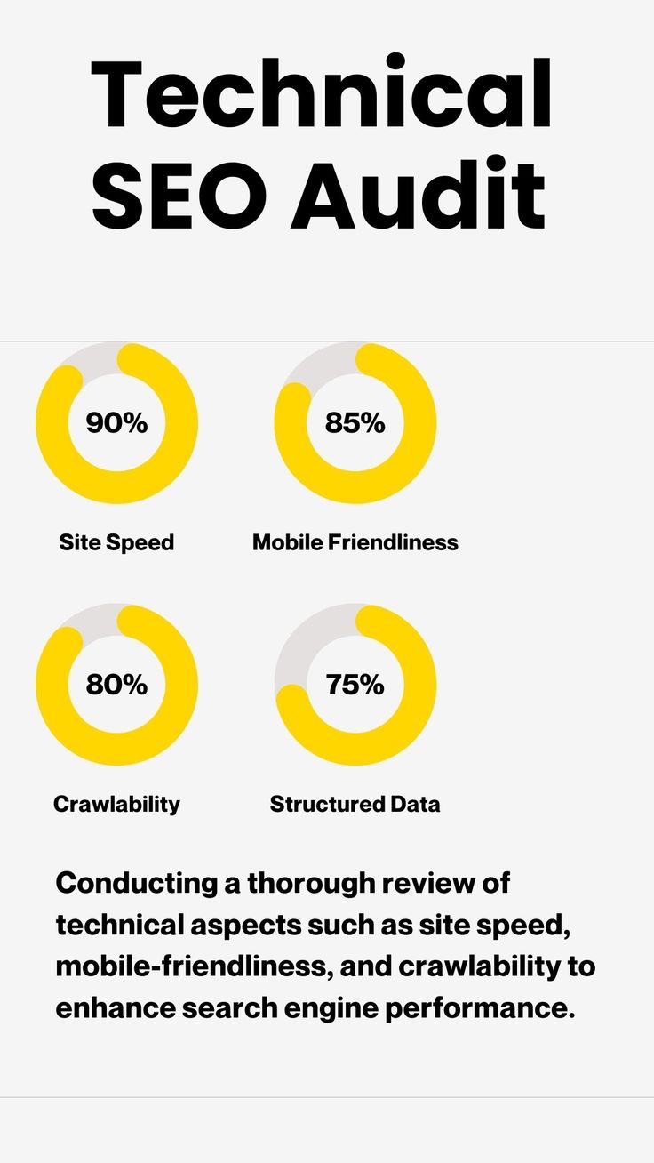
At Bloom Agency, we blend SEO know how, web development, UI/UX optimization, and performance analysis to deliver more complete mobile website audits that fit your business goals.
Our team tracks down technical issues, usability obstacles, and conversion chances before they start hurting rankings and revenue, so your website stays in good shape across every single mobile device.
FAQs About Mobile Website Audits
What Is a Mobile Website Audit?
A mobile website audit is a detailed evaluation of how your website performs on smartphones and tablets. It examines technical SEO, mobile usability, loading speed, content visibility, structured data, analytics, and conversion elements to ensure users enjoy a seamless experience.
How Often Should You Perform a Mobile Website Audit?
Most businesses should conduct a complete mobile website audit every three to six months. Ecommerce websites, high-traffic businesses, and companies launching redesigns should audit their sites more frequently to catch performance issues before they affect rankings and sales.
Which Tools Are Best for a Mobile Website Audit?
A comprehensive audit typically combines multiple tools, including Google Search Console, Google PageSpeed Insights, Lighthouse, Chrome DevTools, analytics platforms, website crawlers, and real-device testing to identify technical and usability issues.
Does Responsive Design Guarantee Mobile SEO?
No.
Responsive design ensures a website adjusts to different screen sizes, but it does not automatically guarantee strong mobile SEO. Your mobile pages still need fast loading times, optimized content, proper indexing, structured data, and excellent usability.

Neetu Wadhwa is the Director of Bloom Agency, a Mumbai-based full-service digital marketing and web development company. With a strong focus on performance, innovation, and strategy, she leads the agency in delivering SEO, web design, and growth marketing solutions that drive measurable business outcomes.






Rahul M.
B2B Service Provider