
 Many beginners confuse web design with web development, and the confusion is understandable. They are both interrelated but they have different functions.
It is a good way to distinguish the difference by using a home analogy:
If a website were a house—
- Web design is the architecture, interior layout, lighting, color decisions, and how smoothly someone can move through the space.
- Web development is the wiring, plumbing, foundation, and engineering that keeps the house functioning.
Therefore, web design is the visual side of the website and the usability—everything a person interacts with and everything that make their way simple instead of confusing.
In very simple terms, web design involves:
- page structure and layout
• spacing and alignment
• how text is printed (typography)
• color palettes and theme consistency
• icons, mages, illustrations, graphics
• hierarchy (which users notice first)
• animations and transitions
• button and form design
• responsive behavior (how content changes for different devices)
For beginners, it is useful to consider web designing as an art work that makes information easy to understand, nice to look at, and simple to navigate.
If you want to understand the modern design rules it is useful to learn how websites looked before and the reasons why the old styles were discarded.
Early 2000s: The Ornamentation Period
The sites used to be very noisy, very eye-catching, and full of the 3D kind of text, effects produced by glitter and movements that are completely unnecessary. The designers were engaged in decorating at the cost of ignoring the purpose.
2010–2015: The Mobile Revolution
One of the things that the arrival of the smart phones changed was the whole concept of web design. The designers came to the conclusion that websites must change their layout to fit smaller screens. Neat layouts, adaptable grids, and minimal UI were what was demanded.
2016–2020: The Rise of UX (User Experience)
Designers began to learn human psychology — how people read webpages, what they concentrate on, what they do with the mouse/keyboard, what confuses them, and what guides them.
This period is characterized by the introduction of heatmaps, user testing, easier navigation, and experience-first thinking.
2021–2024: Accessibility, Speed, and Inclusiveness
Companies came to the understanding that beauty is not the only thing that matters in a design—it has to be usable by everyone.
Quick loading pages, easy-to-read text, user-friendly interfaces, and simple layouts became the norm.
2025: The AI-Assisted Design Era
By 2025 AI means are creating layouts, helping accessibility, user behavior analysis, and when it comes to consistency across a big website carrying out the maintenance work.
Designers are not starting with a blank screen anymore; they cooperate with smart systems that are user-oriented.
This change tells us that current web design is more considerate, more exact, and more focused on the user than ever before.
Why Web Design Matters More Than Ever in 2025

For someone without much knowledge, design might seem like just the “visual layer” or the look of a website. However, the truth is that design changes how a business operates.
- First Impressions Decide Trust
Consumers allocate only 1–2 seconds to assess a brand. In the case where the design is perceived as outdated, cluttered, or disorienting, the level of trust decreases straight away. - Better Design = Higher Conversions
By the mere good layout of a website, the conversion rates can be doubled or even tripled without the need for product changes or increased advertisement spending.
Design is the main factor that attracts the user, removes the obstacles, and gives the user a feeling of trust. - Google Rewards Well-Designed Sites
The speed of the page, usability on mobile, visual stability, and accessibility are factors that affect the ranking of a website. - Users Expect Personalized Experiences
The websites of today change according to the location, device, previous behavior, and preferences of the user.
Design is the major contributor in this. - A Website Is the Only Digital Asset You Fully Control
The social media platforms are always tweaking their algorithms.
The website of a business is still the most dependable, long-term asset.
This is the reason why good web design is not a matter of visual luxury anymore but has become a necessity.
Core Principles Every Beginner Should Know (The Foundation of Good Design)
New learners cannot start off with colors, tools, or trends but they have to get a strong base first. These principles govern each and every decision, even if the tools become very advanced.
- Visual Hierarchy
Visual hierarchy is a very posh expression for “showing people what matters most first.”
New learners in design usually make everything bold or inappropriately color their work with too many colors.
A powerful design only highlights those things that deserve attention. - Consistency
Headings need to have the same spacing. Buttons should be alike everywhere.
When patterns are not matching, users become confused.
Consistency is what allows for fluency and predictability. - Simplicity
People do not remember complex designs.
What they remember are smooth, familiar, and effortless experiences. - Accessibility
A site should be usable by everyone, that includes people with visual, hearing, or mobility impairments.
Making sites accessible is no longer an option; it is a duty. - Interaction & Feedback
Hover effects, micro-interactions, subtle animations—these point out to a user that their action is being carried out.
Proper feedback is what makes the user feel secure and hence, fewer mistakes are made.
These principles are the core of present-day design across various industries.
Understanding UI vs UX (Beginner-Friendly and Deep Explanation)

Newbies in web design often come across terms UI and UX and most of the time they have these two mixed up. To user interfaces and user experiences belong two different concepts that are often mistaken, because they have similar names, they are interdependent and the final product of the website is a result of both. However they are very different from each other and hence exist for very different purposes.
One way to consider the difference is:
Comparing a website to a restaurant:
UI (User Interface) is the interior of the restaurant, the menu design, the lighting, the plates, the colors and overall how everything looks and how inviting it is.
UX (User Experience) is the flavor of the food, the friendliness of the staff, the time it takes to get your order, the simplicity of the menu and whether you go away satisfied.
- UI is attractive to the eyes.
- UX is attractive to the mind.
We can even go further and still keep it simple.
What Is UI in Web Design? (A Beginner’s Visual Guide)

UI is all about the presentation layer – what you can see, touch, click, scroll, or interact with. It is essentially the work of creating the website’s visual look in a way that seems to be made by a professional.
UI features:
- Color palettes
- Fonts
- Layout
- Framework consistency
- Pictures and drawings
- Button designs
- Card presentations
- Shadows, borders, and visual structure
- Animations and transitions
Consider UI as a form of visual storytelling. Every decision – even the curve of a button – conveys the brand’s personality.
So, a financial technology website would feature blue, white, and simple lines to impart the feeling of trust.
Likewise, an eCommerce fashion brand could go for bright colors, stylish fonts, and big photographs.
Good UI doesn’t divert your attention.
It helps.
What Is UX in Web Design? (The Psychology Behind the Screen)
UX is where design meets real human behavior. Instead of asking “Does this look good?” UX asks “Does this make sense?”
A beginner-friendly way to think about UX:
UX is understanding:
- what users want
- what frustrates them
- what helps them finish tasks faster
- how to reduce confusion
- how to build predictable, logical experiences
UX involves:
- research and user testing
- wireframes (simple blueprint layouts)
- content flow
- navigation planning
- accessibility
- usability principles
- identifying friction points
- reducing steps in a journey
- improving the feeling of control
A beautiful UI without UX is like owning a stunning sports car with a terrible engine — it looks amazing but drives horribly.
In 2025, UX is also deeply connected to:
- how search engines evaluate websites
- how fast users leave or stay
- whether visitors convert
- how well mobile flows function
- how accessible the site is for everyone
UX is the reason why:
- Amazon places “Add to Cart” exactly where it does
- Netflix auto-plays previews
- Google shows clean, simple interfaces
- Zomato uses red and bold labels for food items
UX makes decisions effortless.
UI & UX Working Together: A Practical Example for Beginners
Imagine a website homepage with a “Get Started” button.
UI decides:
- the color (should it be blue? green?)
- the size
- the shape (rounded or sharp?)
- the placement (center or right?)
- the animation (hover effect? subtle glow?)
UX decides:
- whether “Get Started” is the right wording
- whether users expect this button here
- whether the button appears above the fold
- whether extra steps are needed before clicking
- whether users understand what happens after clicking
UI answers how it looks.
UX answers how it works.
For beginners, this distinction becomes a stepping stone for everything that comes next.
Why Understanding UI & UX Is Crucial in 2025
Modern web design is shaped by rapidly changing user behavior. People browse differently today:
- They switch devices constantly.
- They scroll faster and read less.
- They expect websites to “just know” what they want.
- They judge credibility instantly.
- They get frustrated easily.
This means UI and UX are no longer optional skills—they are the backbone of every modern website.
In 2025:
- AI tools create layouts automatically, but humans still make UX decisions.
- Personalization requires thoughtful UX planning.
- Minimalist interfaces need excellent UI clarity.
- Accessibility rules demand deeper UX understanding.
- Mobile-first design means UI must adapt to tiny screens without losing beauty.
Even the best developers can’t save a site with poor UX.
Even the best content can’t shine through bad UI.
Great design in 2025 = UI + UX working in perfect harmony.
The Beginner Advantage: Why Learning UI/UX Early Sets You Apart
Most beginners jump directly into tools like Figma, Canva, or Webflow and start dragging boxes around.
But that leads to messy design.
Learning UI/UX foundations early:
- makes you faster
- helps you avoid rookie mistakes
- improves your creative thinking
- increases your value in the industry
- sharpens your understanding of user psychology
- helps you design with purpose, not decoration
Web design isn’t about making screens pretty.
It’s about making experiences meaningful.
And UI/UX is the language that helps you create those experiences.
The Anatomy of a Modern Website (Deep, Expanded Breakdown for Beginners)

At a simple glance, a website might look like a mere canvas, but it has a complex structure underneath — something similar to a fully functioning, self-sufficient city. Every bit has a role, every piece has a function, and every design decision is related to the way humans think, behave, and get information. When beginners grasp this internal framework, they no longer consider websites as “nice screens” but as systems which are meticulously designed to lead the users from the stage of getting curious, to understanding, to trust, and finally, to taking action.
Web design in 2025 has moved beyond just putting together the visuals. It is about creating an experience. Understanding the anatomy of a website means knowing how to design that experience from scratch.
Each element of a website is like a layer under the roof; we dissect them one by one and reveal more of a contemporary website.
1. The Header (Your Website’s First Handshake)
In a sense, the header is the initial moment of meeting with a visitor. It is visible on all pages and silently communicates the atmosphere, e.g. like welcoming a guest in your home. A trendy 2025 header normally consists of:
- brand logo
- navigation menu
- call-to-action button
- mobile hamburger menu
- occasionally a search bar
Its role is to remain there without being intrusive. Too many links or overly designed layouts disorient people who are visiting your site for the first time and frustrate users. Sticky headers are widely used now because they facilitate the process and keep the navigation close at hand while scrolling. The hamburger menu on mobile becomes the main tool for space-saving. An effective header raises conversions, decreases bounce rate, and makes the site instantly more user-friendly.
2. The Hero Section (The Most Important Real Estate)
Right underneath the header is the hero section which is the most valuable real estate of the whole website. It is the place where the website sets expectations, creates emotional impact and, shows its friendliness, all without the user having to scroll.
An effectively working hero section generally has:
- a bold headline
- a brief explanatory subheading
- a strong primary call-to-action
- visual support like an image, mockup, or illustration
It is a simple yet very important job: to make a visitor stay. Within a few seconds people decide whether they continue exploring or not. The headline should be very clear, the value should be very direct, and the design should give a feeling of trust.
When a hero section confuses, is overly artistic, vague, or cluttered, the user will leave. That is why modern hero designs are all about simplicity, whitespace, and clarity. Many brands today are using dynamic visuals, video loops, or minimal animations to evoke emotions without taking the attention away from the message.
The most powerful hero sections understand user needs, address them directly, and then lead the users onward through a clear CTA — the next step’s path.
3. Content Sections (The Brain of Your Website)
Once the hero has done the job of getting the interest, the subordinate content sections have the power to do the rest of the work. They are basically the storytelling chapters of a website. These sections help to broaden the knowledge of the visitor, remove doubts, show up skills, and eventually bring the visitor to the point of making a decision.
Usually, the company website displays the following sections:
- Features or services
- Benefits
- Portfolio / case studies
- Process or workflow
- Testimonials
- FAQs
- Trust elements (badges, certifications, stats)
These parts pump up the energy in a natural way. A visitor is not simply reading; they are being led. Every block here answers a question, solves a worry, or provides confirmation. Designers choose structured layouts like grids and cards to make the content more accessible visually as today’s users are more likely to skim than read.
Grid systems help to establish rhythm, bold headings make it easier to glance over the text, short paragraphs improve understanding, and icons facilitate the process of taking in the information quicker. A rightly constructed content section is not about displaying everything – it is about presenting everything in the proper order. The sequence is equally important as the design itself.
4. The Sidebar (Optional but Powerful)
While sidebars are optional, they can still visually structure and make clear the heavy content of a website if they are used properly.
Sidebars can have:
- Category lists
- Filters
- Recent posts
- User options
- Quick links
As the case may be, on blogs, they assist users in discovering. In the case of eCommerce sites, they allow users to filter the products. On dashboards, they serve as the primary navigation. However, the effectiveness of a sidebar is derived from its limitation. When beginners stuff sidebars with ads, irrelevant links, or random widgets thereby causing users to lose focus, users get irritated. The sidebar should be there to help the main content, not to challenge it.
5. The Footer (Your Website’s Final Touchpoint)
When people scroll to the end of a page, most of the time they are looking for clarity, trust, or guidance. A footer is like a safe place — “the last opportunity” to assist users before they go away.
A nice footer is typically made up of:
- Essential links
- Social media icons
- Contact details
- Copyright information
- Maybe a newsletter section
Contemporary footers resemble more of the reduced version of the site map. They assist users who still have questions, require help, or are willing to visit a different department. As footers are on every page, they become a stable support that trust gets reinforced.
6. The Back-End Architecture (What Users Can’t See)
The back-end is basically the invisible stuff that goes on behind the scenes in a website. In fact, if a person only concentrates on design, knowledge of the back-end fundamentals will still make that person a lot more proficient.
Back-end elements include:
- servers
• databases
• content management systems (CMS like WordPress)
• APIs
• user authentication systems
• security layers
• hosting infrastructure
A website that is visually appealing but is slow, insecure, or unstable is a failure for the user. Designers who have an idea of the functioning of the back-end can create interface designs that take into account the presence of loading times, data flow, and technical limitations besides other real-world constraints.
7. The Visual System (Design Rules That Keep the Site Consistent)
Every modern website relies on a design system — the visual blueprint that prevents chaos.
This system includes:
- color palette
• spacing sizes
• grid rules
• heading styles (H1, H2, H3…)
• button variations
• icon styles
• image ratios
A visual system is the main tool to keep everything in the right order. It stops designers from picking random colors, mismatching icons, using different text sizes, or uneven spacing. It is what makes the site look like it is from a professional, trustworthy, and cohesive brand. Most of the time, the work is so flawless that users don’t even realize the presence of the visual system they just get a feeling that the website is reliable.
8. The Interaction Layer (Where Websites Feel Alive)
Modern websites aren’t static anymore. They guide the user through tiny signals that make the interface feel alive.
Interactive features include:
- hover effects
• micro-animations
• scrolling visuals
• loading transitions
• clickable elements
• form feedback
Such interactions aid users in comprehending which items are clickable, what is going on, and what the system is expecting from them. They lessen uncertainty and elevate the level of user participation. The user’s following action can be made more visible by a tiny hover animation; a little shake can indicate that there is an error; the user’s nervousness can be alleviated by a progress bar. These little signals have a big say in the user’s journey.
9. Mobile Structure (Designing for the Smallest Screen First)
Mobile traffic is the leading factor in almost every industry, thus websites are being designed with a mobile-first approach. Designers decide the layout, spacing, and navigation based on the smallest screen and then adjust it for bigger screens.
Mobile structure includes:
- collapsible menus
• single-column layouts
• larger buttons
• optimized images
• vertical spacing rules
Designers picture a person looking through the internet while walking, multitasking, or holding the phone with one hand. This changes everything – typography, button size, scroll length, content density, and even color contrast. A desktop design that is great has no value if the mobile version annoys users.
10. The Conversion Layer (Turning Visitors Into Customers)
Every website has a purpose. The conversion layer ensures users can complete that purpose effortlessly.
Conversion-focused elements include:
- CTAs (calls to action)
• forms
• countdown timers
• trust badges
• social proof
• benefit-driven copy
Psychological principles are combined with visual design in this layer. The main objective is to minimize the user’s hesitation and to make the following step appear as something the user would naturally do. Where the CTAs are positioned, how clear the forms are, whether the user can see the benefits — all these things, individually and collectively, contribute to the final effect. Any website which does not have a strategy for conversions might still look nice but will not produce any leads.
Why Understanding Website Anatomy Helps Beginners Master Design
Newbies that really understand how a site works inside out materialize great wins for themselves:
- The design of a website makes sense
- Colors are chosen for their purpose
- Users find their way easily
- The writing has a clear logic
- The actions of users can be anticipated
After the framework is established, each creative decision is made with a purpose rather than by chance. You move from creating attractive visuals to creating impactful user experiences.
Beginner-Friendly Breakdown of Modern Web Design Tools

Contemporary web design originates from the devices that facilitate the conversion of the brainchild into an operational website. Devices do not supersede inventiveness, yet they do lessen the steepness of the learning curve. In 2025, novices mainly use three primary types of instruments that were different in function.
Website Builders (WordPress, Shopify, Wix, Webflow, Squarespace)
- The platforms mentioned above provide newcomers with a facilitated setting, most of the technical intricacies being taken care of by them.
- The use of drag-and-drop editors, responsive templates, and integrated hosting is a way of limiting the fear of “breaking” the website.
- WordPress is the engine of a large part of the internet and continues to be the easiest way for business websites and blogs.
- Webflow combines the unlimited designer’s creativity with the accuracy of code-like, thus helping newbies to comprehend the real HTML and CSS without manual writing.
- Shopify is an eCommerce leader because it manages checkout, security, payments, and product management without the need for coding.
- Builders are great for newcomers who want to have a dependable site fast without having to learn development first.
Design Platforms (Figma, Adobe XD, Canva)
- These instruments allow to visualize the website during planning and designing stages before actual building.
- Figma is the leader in the market because it provides design of the layout, prototyping, collaboration, and feedback — all in real time.
- Newbies use Figma to learn spacing, alignment, grids, color systems, and user flows and are not concerned with coding.
- Adobe XD continues to facilitate UI design and is slowly becoming obsolete compared to Figma’s speed.
- Canva is the most user-friendly platform for non-designers who want quick graphics, banners, and social posts for their website visuals.
- Working with design tools first saves the newcomers from abruptly diving into development without having a clear layout and structure.
• Development Environments & Code Tools (HTML, CSS, JavaScript, VS Code, GitHub)
- That is the place where one gets unlimited options for customization of the initial concept. Newbies have the possibility of full control but their learning curve is quite steep.
- HTML organizes the content, CSS determines the visual, and JavaScript is used for adding animation and interaction elements.
- VS Code is the favorite code editor among developers as it is not heavy, can be tailored as per needs, and is packed with useful extensions.
- GitHub is the tool for managing version control through which beginners can store their work, go back to previous versions, and collaborate in a secure way.
- Although React or Vue are complex, they can be used to efficiently build modern web applications when the user has the basic knowledge of the field.
- AI-supported programming utilities locate errors that need correction, suggest enhancements, and enable users to grasp concepts which used to require long hours of searching.
How Beginners Should Choose Their Tools
- The “best” instrument depends on the target, not on the level of difficulty or popularity.
- WordPress is definitely the fastest way to grow a business website.
- The most suitable platform for an artistically innovative portfolio is usually Webflow.
- A learning route can start with Figma and gradually work its way towards fundamental HTML and CSS.
- The brightest beginners do not put all their eggs in one basket, i.e. they don’t strive to master everything at once. They know how each tool is a stepping stone towards a bigger journey from idea → layout → working website.
Core Visual Design Principles Every Beginner Must Know

Tools for web designing are what you use to make a website, however, simply having the tools doesn’t result in an experience that users like. After you have figured out how to construct, the following step is figuring out how to present it attractively and making it simple for users to find their way.
These are the main design concepts that are involved—features such as color, font, and even the space that are all part of the layout and determine the user’s emotional response at the very moment your page appears.
1. Color & Typography (How Beginners Shape a Website’s Personality)

• Why Color Matters
- Color is the main emotional driver of a webpage—basically, the color tells the mood to the visitor before he/she reads a single word.
- Newbies are very often tempted to choose their “favorite colors,” however contemporary design selects palettes by considering psychological factors, contrast, and brand identity.
- Red and orange colors are usually described as being energetic and urgent ones.
- Blue and green colors are usually associated with calmness, trust, and minimalism.
- White, grey, and black colors are contributing to creating the balance and professionalism.
- The websites of today which depend on three color categories: primary, secondary, and neutral, are able to maintain color consistency throughout various pages.
• How to Build a Beginner-Friendly Color Palette
- One primary color has to be the starting point of the palette — the brand’s signature shade.
- Pick up a secondary color which complements rather than dominants your primary one.
- Don’t forget 3–5 neutrals that will be used for backgrounds, cards, footers, and text.
- Ensure that the high contrast is used in buttons and headings in order to keep them readable.
- Keep the same shades for your CTAs in order to let users instantly recognize the interactive elements.
• Typography: The Silent Structure of a Website
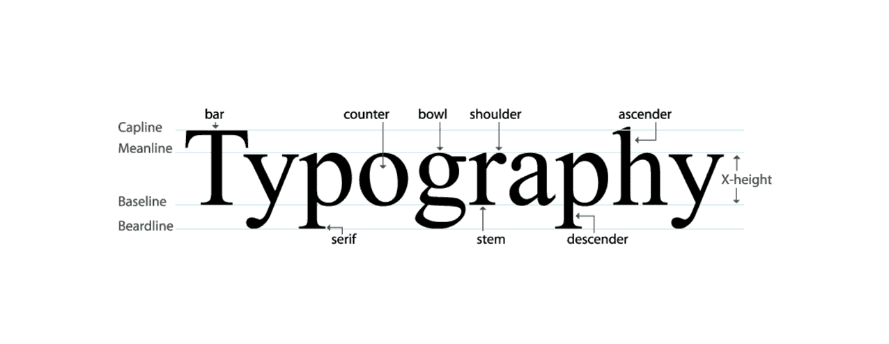
- Typography governs aspects like readability, hierarchy, and the degree of “professionalism” that a site is able to convey.
- Newbies are inappropriately tempted to combine too many fonts, which results in a noisy visual environment.
- Present-day web projects are limited in their selection to just two font families: one for the headings and the other for the body of the text.
- The sans-serif typefaces are thought to be modern and clean while the serif ones bring a classic and editorial note.
- The font weight (thin, regular, bold) is almost equally with the font size a magazine of the user’s attention.
How Typography Shapes User Behavior
- Large, bold H1 headings attract the eye to each section and indicate the underlying structure.
- H2 and H3 medium-weight headings enable really fast readers to quickly grasp what the page is about.
- Brief paragraphs together with 16–18 px body text and ample line spacing help the text become mobile-friendly and thus easily readable.
- If the typography is consistent, the website will not look like a mess even though the content might be of a heavy nature.
Color + Typography: How They Work Together
- Color shows the most important things that need to be talked about, and typography is the way those things are understood.
- Effective CTAs comprise three elements: a color with a great contrast to the surroundings + use of bold letters.
- Using soft neutrals along with elegant type is a good way to let people see a calm, minimal look.
- Being loud on the one hand, and also having geometric fonts on the other hand, can be the factors, which, when combined, impart a modern, energetic feel.
- In fact, they are the components giving the website its “voice” — confident, friendly, bold, or subtle
3. Responsive Design & Layout (How Websites Adapt to Every Screen Size)
Why Responsive Design Exists
- A user can view a site through various devices, the size of which can be anything from a small phone to a very wide monitor.
- If there is no responsive design, layouts may “break” — texts lose their readability, images might overflow, and the buttons could disappear.
- Today web design is such that any page is made to reconfigure itself automatically and thus clarity and usability get preserved in every case.
The Core Idea: Fluid, Not Fixed
- Long time ago there were web pages which had widths measured in pixels of a certain fixed value and therefore these pages fell apart when viewed on small screens.
- The current responsive design adjusts its width through percentages, flexible grids, and also uses fluid images.
- A website is no longer just one fixed layout but more like a liquid which “fits” the shape of the device it is looked at.
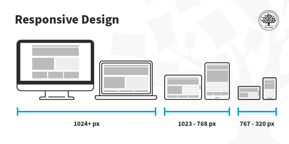
Breakpoints: The Checkpoints of Modern Design
- Breakpoints refer to the widths of the screen where the design changes are made.
- Typically breakpoints:
- 320–480 px (small phones)
• 768 px (tablets)
• 1024 px (laptops)
• 1280–1440 px (desktops) - Designers adjust the spacing, the size of the images, and also the scaling of the fonts at every breakpoint.
- The intention is to produce a few designs only, which is very different from what most people think. Each device should work seamlessly.
Mobile-First Design Philosophy
- The development of modern sites is done from the perspective of the smallest rather than the biggest screen.
- Mobile-first approach makes designers focus on what is really important: content, buttons, and readability.
- If you begin with the smallest size, then whatever you add later (for example additional columns, animations) will not make the layout messy.
- Besides that, Google also helps mobile-first designed websites to rank higher.
Layout Patterns Every Beginner Should Know
- When it comes to mobile devices a single-column layout is preferable as it provides better scrolling and reading.
- Through the use of multi-column grid layouts tablets and desktops can be turned into excellent workspaces.
- Cards are the best way to organize information into small chunks — this method works great for services, products, and blog posts.
- Masonry layout is the best option for structures which contain a large number of images such as portfolios.
- With the help of full-width hero sections the page is “anchored” and big visuals become able to scale smoothly.
Flexible Images & Media
- Images become adaptable automatically with rules like “max-width: 100%”.
- This way overflow is stopped and the quality of the visuals is kept even on retina screens.
- Present-day websites convert images to newer formats such as WebP to accelerate loading.
- Responsiveness is also there in video elements nowadays which have liquid containers and can scale dynamically.
Buttons, Forms & Navigation on Small Screens
- Buttons turn bigger and are made one that only the thumb can use for tapping.
- Forms become easier — less number of fields, inputs one under another, bigger tap areas.
- Navigation changes to a hamburger menu to continue being clean while presenting.
- Pop-ups are lessened because they interfere with mobile UX and hence SEO is also affected negatively.
Responsive Typography
- Contemporary type changes its size depending on the width of the screen and hence it uses fluid units such as “rem” and “vw”.
- On phones headings become smaller in a nice and smooth way, without confusing the hierarchy.
- The amount of space between lines also becomes bigger on small screens so as not to crowd the text.
Why Responsive Design Matters for Business
- The existence of a responsive website is one of the main reasons why a site’s bounce rate can be brought down so drastically.
- Users do not want to leave the site because they can have a good experience on their own device which seems to be a natural thing.
- Google gives better positions in their ranking to those sites which are responsive.
- A responsive design solution makes it possible to get rid of those separate mobile sites thus the development cost is saved.
The Ultimate Beginner Lesson
- The responsive-design concept is not a temporary one — it is actually the basis for all present-day web designs.
- When beginners have the knowledge of how screens work, then they will be able to design with certainty instead of by trial and error.
- The aim is very straightforward: whatever device the user chooses, the site has to be such that it looks as if it was created for that device only.
The Future of Web Design: What It Means for Businesses in 2025 (Dense + Short)
In 2025, web design has essentially become the main driver of the website’s success rather than just a tool for making the site look visually appealing. People nowadays expect a site to be able to load instantly, fit any screen size, help users in making their decisions, and give a sense of trust even before any word has been read. The use of AI for personalization, simpler designs, and the implementation of stronger UX principles are the major changes that now determine how customers perceive brands online.
Companies that commit to well-planned design get the chances ringing in their ears: increased user engagement, decreased bounce rates, and higher conversion rates. On the other hand, those who continue to adhere to old-fashioned, cluttered structures are becoming irrelevant rapidly. The future is for websites that look user-friendly, reliable, and offer value — without being too much. When beginners grasp this change, their design choices become much more purposeful.
How Bloom Agency Approaches Web Design in 2025 (Dense + Short)
Bloom’s approach focuses on clarity, structure, and user psychology — turning design into a predictable, repeatable process.
- Discovery
Understanding the brand, audience behavior, and business goals to create a precise design direction. - Structure Planning
Mapping user flows and sitemaps so every page has purpose and every click has logic. - Visual Design
Translating strategy into color systems, typography rules, spacing patterns, and a consistent aesthetic. - Responsive Layouts
Designing mobile-first and ensuring every layout adapts naturally across devices. - Development
Building high-performance pages with clean code, optimized loading, and strong accessibility. - Testing
Auditing responsiveness, clarity, usability, and speed before the site goes live. - Launch + Iteration
Publishing the site and refining it through analytics, user behavior, and performance insights.
Conclusion: Web Design in 2025 Is a Skill of Clarity, Structure, and Purpose
Web design has changed to a practice that requires both creative and logical ways of thinking no one can simply choose one of them as they now work hand in hand. The power of attracting to a website is no longer a thing that can be decided only by the most splashy and the most visible parts of it such as the pictures or the videos, but by the way the site communicates, how users are guided without them having to ask and the performance of the site on every device used.
When freshers take a thorough dive into a site not only to find out the elements of a website but also the logic behind modern layouts and the factors that are considered by the reasoning, design becomes a non-issue. It gets structured.
Nowadays companies want websites that seem to be fast-loading, user-friendly, and trustworthy at first glance. Designers who understand these fundamentals are actually placing themselves at the center of a digital world that is more and more dependent on clarity. The road to the future is lined with signposts: know users thoroughly, create intentionally, and develop consistently.
FAQ
- What are the main duties of a modern web designer?
A web designer primarily works on the appearance, the operation, and the feeling of a site, among other things. They use graphics, layout, and user-friendliness to the maximum to give users an experience that, in terms of quality, is the least of their efforts made.
- How long would it take to create a website design?
The time required to create a simple website design is around a week while that of a full business website design may take a month or a few weeks. The time allotted for the work is always an issue whose significance is figured out by the complexity of the task, the readiness of the content, and the number of revisions.
- If I want to build a website, must I know how to code?
No, definitely not. Programs like WordPress, Webflow, and Shopify allow beginners to create websites without coding, but if you want to have a deeper customisation, coding is necessary.
- What sorts of things would make a website be considered as looking professional?
First of all, it is branding that is done in a consistent way, then comes the use of the right kind of typesetting, and lastly, there is the matter of good spaces and fast loading. Professionally done websites are described as being well-planned and well-executed ones.
- Why is mobile-friendly design important?
The thought that most users would be accessing the Internet through their smartphones is what made mobile-friendly design so necessary. The term responsive site is used to refer to the one that can be changed automatically to a specific device thus improving the user experience and making the site more attractive to search engines.
- What is the price for web designing generally?
The cost that is associated with web designing can be as minimal as that of a DIY tool or quite high if a professional is hired, the difference varies greatly between the two. The price of web designing may start from very low if one is going to do it by oneself using cheap tools and can be in the thousands of dollars in case one decides to hire a highly skilled designer and request many features and pages.
- What is the difference between web design and web development?
While web design is mostly about doing the visuals and the user experience, web development is the setting up the backstage infrastructure that actually makes the website operate.


Rahul M.
B2B Service Provider