
The first paragraph describes a store which has free walking paths and visible signs and creates a friendly shopping space. The second paragraph describes an area which has many objects lying around and creates a chaotic environment which prevents people from finding their way. Which store location do you prefer to spend more time in?
Websites follow the same fundamental rules which govern their operation. Bloom maintains that a website should instantly engage visitors while allowing them to navigate the site and providing a smooth and satisfying user experience. Visitors to a badly constructed website will experience immediate frustration which causes them to leave the site.
Business websites require web design because it serves as the essential element for online business expansion. The initial contact point with users establishes their trustworthiness while the website guide introduces them to the sales process which ultimately increases conversion rates and revenue generation. Bloom uses creative web design methods together with strategic business development methods to create websites which generate measurable business results.
The beginner’s guide to web design presents essential design principles and practical design methods which create user-friendly websites. The following topics require your attention:
- What Is Website Design?
- The Evolution of Website Design for Beginners
- UX vs. UI
- Key Elements of Effective Web Design
- How To Design a Website for Mobile: 5 Tips
- The Role of Accessibility in Modern Web Design
- Web Design Basics: Integrating SEO Into Your Site
- Explore the Future of Web Design: 5 Trends for 2026
The following content explains the process of designing a website which achieves high search engine rankings while transforming online visitors into paying customers.
What Is Website Design?
The web design process includes three main activities which are website creation and website planning and website conceptual design. Bloom builds digital experiences which users find visually attractive and functionally effective and user-friendly through its combination of technical expertise and creative strategy.
Web design defines how online content gets organized and displayed to internet users. This system includes layout designs and color selection methods and typography styles and image usage and interactive design components which all work together to create a unified brand experience.
The Evolution of Web Design for Beginners
Website design has evolved significantly since the early days of the World Wide Web. The development of modern websites needs new technologies and design trends and user expectations which have emerged during each website design stage.
The Early Days: Text-Based Design
The 1990s saw the establishment of websites which operated through text content and fundamental HTML design to create static web pages. The original websites functioned as working websites but they failed to provide users with visual attraction and interactive features. The design process concentrated solely on delivering information to users. Nowadays Bloom gives priority to creating engaging user experiences through modern web design work.
The Web Design Museum presents a screenshot which shows the Tour de France website from 1994, displaying the text-based design that characterized early websites. The layout uses basic design elements through bullet lists and hyperlinks which work with French flag graphic, which serves as its only design element. The early designs at Bloom show our progress in developing better user experience through aesthetic design improvements.
The Rise of Graphics: The Late 90s
As technology advanced, websites began incorporating more visual elements. The introduction of images, tables and frames enabled higher visual structure through development of more interactive presentation options. Designers started creating color schemes and typography together with essential branding elements to design websites which better attract users.
The 1996 Johnson & Johnson website shows a shift toward visual design through its new design elements. The website maintained its text-centric design while adding more visual elements through its branding package, which introduced a prominent logo and blue navigation buttons. The Bloom team considers this period to be the starting point of contemporary web design services because it marked the time when websites combined their functional elements with their visual components.

The Flash Era: Early 2000s
The early 2000s marked the rise of Adobe Flash which enabled designers to build interactive websites with animated content. The system enabled users to experience interactive multimedia content which included animations and games and dynamic navigation elements through its development from basic static web pages.
The creative and attractive visual elements of Flash made it visually appealing to users but the system operated with multiple restrictions. Flash websites required extensive resources which resulted in slow loading times and operated poorly on mobile devices. The websites excluded users with disabilities while search engines encountered problems in crawling their content which led to declining search engine optimization results.
The Bloom organization recognizes this time period as a critical historical moment because technological progress introduced new possibilities while users needed modern web design elements which included performance requirements and accessibility standards and search engine optimization methods.
The Nintendo website from 2002 provides an authentic representation of interactive online content from that particular time period. The website design uses graphics and animated elements together with user features which include player polls and dynamic navigation systems to create an interactive experience for users. Bloom identifies this period as the time when brands shifted their focus from static information to active customer interaction.
Web technologies evolved during this period which enabled websites to use Adobe Flash as a tool for developing interactive content creating an entirely new way for users to experience online content.
The Advent of CSS and Web Standards: Mid-2000s
The mid-2000s marked a major shift toward cleaner, more structured web development with the introduction of Cascading Style Sheets. CSS allowed developers to separate content from design, giving them greater control over layout, spacing, colors and overall presentation.
The transition required developers to implement semantic HTML together with accessibility best practices. The foundational period of web design development at Bloom established modern web design services which enables faster website loading and better site maintenance and user experience improvements that continue to shape current website development practices.
The fast-food giant’s website experienced a significant redesign process during this time frame. The website used graphic-heavy design with bright colors and few words during its original 2000s period, but by 2009 the design evolved into a more orderly and neat appearance. The combination of better typography, distinct section borders and improved product image display created a better user experience which people could access more easily. The Bloom team considers this period to be the moment when people started to value usability more than visual design experimentation.
Mobile-First, Responsive Design: 2010s
Responsive design became essential when smartphone and tablet usage reached widespread adoption. Designers started implementing flexible grid systems together with media queries and responsive images to create websites that functioned properly on all screen dimensions.
The Bloom team implements a mobile-first design method which starts with designing for smaller screens before expanding to larger screens to deliver optimal performance and faster load times and consistent user experiences across all devices.
Modern Web Design: 2020s and Beyond
Today, web page design is centered around user experience (UX) and user interface (UI) principles. At Bloom, the focus is on creating seamless, intuitive and engaging digital experiences that not only look great but also perform.
Modern technologies like HTML5 and CSS3, along with JavaScript frameworks such as React and Vue.js, enable the development of highly dynamic and interactive web applications.
At Bloom, we leverage these tools to build fast, responsive and conversion-focused websites that align with modern user expectations and business goals.
The design world has moved beyond its previous state because minimalism and flat design have become common design methods. Our team at Bloom establishes clean design systems which include functional design elements to create a space that improves user experience through its organized appearance. The present-day websites require accessibility and inclusivity as fundamental needs because all users, including those with disabilities, need to access and use digital content.
UX versus UI
The building blocks of website design start with UX and UI which serve as the two main components. The two groups need to collaborate for their work but their separate missions demand different tasks.
UX
User experience (UX) covers the complete path which users traverse on your website starting from their first contact until they achieve their objectives. The UX design process at Bloom requires user behavior research which leads to persona creation and user flow mapping and information architecture development through wireframes and prototypes.
The team intends to develop a website that users will find easy to use while achieving their required functions and meeting their standard operating procedures. The user experience design process creates pathways which users should follow to achieve their desired results.
UI
User interface (UI) design focuses on the visual and interactive elements of a website. The elements of design include layout, typography, color schemes, icons and buttons.
At Bloom, UI design brings the UX strategy to life through visually engaging and brand-consistent designs. UI designers create visual prototypes and design manuals which focus on both visual appeal and emotional user experience to produce a final design that performs effectively while delivering a satisfying user experience.
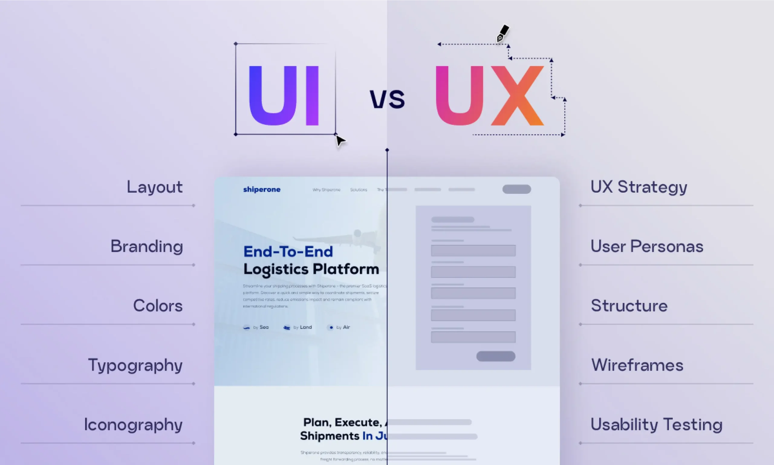
The fundamental elements of UX and UI design function as essential components for website creation which beginner designers need to use because these elements determine the path which users will take through the site while they interact with it and the site will operate and the business will generate revenue.
Key Elements of Effective Web Design
The following section of our web design guide will identify the main components which lead to outstanding design results. The Bloom team creates websites through creating a design system which balances three key elements usable design aesthetic design and efficient system performance.
Simplicity
The user interface design requires a clean design which enables users to concentrate on important information. The Bloom team creates website designs which enable visitors to instantly comprehend website goals while they can locate information without experiencing any confusion or interruptions.
A basic web design commonly includes these components:
- Minimalist layouts with ample whitespace, creating clarity and breathing room
- Readable fonts with consistent sizing for headings, body text and links
- Simple icons and imagery plus graphics which function as content support elements.
Proper implementation of simplicity results in better reading and navigation experiences for users while enhancing their complete product experience. At Bloom, we apply this principle to ensure users are guided naturally toward key sections, whether that’s services, products or conversion points.
Consistency
The design needs to maintain uniformity through its color and font and layout elements which enables users to experience a consistent interface throughout Bloom. We guarantee that each page maintains a single design system which enables users to move through the website with ease. The placement of headers and footers and sidebars and content areas needs to follow a standardized grid layout system which improves design consistency.
The design decreases mental effort which enhances user ability to identify information locations. Users develop better understanding of product design when designers apply standard color schemes to all interface elements. The product design experience becomes better when users link particular colors to specific actions because they will interact with the design more frequently.
Typography and Readability
The organization of content through typography creates paths for users to follow throughout the webpage. The Bloom content team establishes visual hierarchy to help users find and understand all webpage materials.
The design uses different styles for headings and subheadings and body text to show their specific functions and how they connect with each other. Designers use bold and italic and underlined text to create emphasis for crucial information and essential links.
Slack shows excellent reading capability through its combination of contemporary sans-serif fonts and organized text structure. The Bloom web design method uses this technique to keep content clear while delivering a balanced visual presentation with enough space between sections.

The selection of appropriate fonts together with the requirement of maintaining adequate text-to-background contrast will determine how easily readers can comprehend the material. At Bloom we select web-safe typefaces which maintain readability at all viewing distances to achieve our goal of delivering clear information. Digital content creators prefer to use Arial or Helvetica which are sans-serif fonts because these typefaces combine modern style with excellent readability properties.
Responsive and Mobile-Friendly Design
The fact that most users now access websites through their mobile devices means that organizations must adopt a mobile-first design strategy which has become an industry standard. At Bloom we create our websites to deliver perfect performance on all types of display screens which include various screen dimensions and different display quality specifications.
Mobile-friendly design provides users with an uninterrupted experience which uses layout changes to improve both navigation and content delivery. The system enables users to access all site elements through smaller screens since menus and buttons and images automatically scale down. The design enhancements make it easier to use the site while they help achieve higher user participation and conversion success rates.
Your website needs to provide users the same experience on all three platforms, which are desktop computers, tablet devices and mobile telephones. Bloom maintains this experience to establish trust with users while enhancing usability and building brand trust across all platforms.
A well-chosen color scheme and high-quality visuals play a major role in shaping user perception. At Bloom, we choose color palettes which match a brand’s identity and values and emotional tone, while maintaining consistency throughout all website sections.
The repeated application of colors helps people identify a brand, which results in a harmonious visual presentation. The website uses high-quality images, which create a more attractive and immersive experience for users.
Speed
A balanced color scheme also improves readability. Strong contrast between text and background is essential for accessibility, especially for users with visual impairments. Different colors trigger different feelings: warm shades between red and orange bring forth dynamic feelings, while cool shades between blue and green lead to peaceful feelings. Your brand message should determine which colors you will use in your design.
Website speed serves as a fundamental element, which affects both user experience and search engine optimization results. Pages that load faster help decrease user irritation, which results in longer site visits, increased exploration and better conversion rates. At Bloom, we optimize site performance to ensure quick load times across devices. A website that operates quickly results in decreased bounce rates, increased user interaction and improved website ranking positions.
Easy Navigation
The website requires users to understand its navigation system, which needs to be both clear and easy to use. At Bloom, we create site maps which enable users to reach their desired content without experiencing any disorientation.
The website design, which includes straightforward menus and obvious navigation points and systematized page content, enables users to move between different website sections, which lengthens their stay and boosts their likelihood of making a purchase.
How To Design a Website for Mobile: 5 Tips
Worldwide smartphone adoption keeps growing while mobile devices have become the primary method for internet access. Bloom has dedicated its design process to create websites which work perfectly on all screen sizes. Businesses who fail to create mobile-friendly websites will experience a decline in customer interaction and sales and they will miss valuable chances to grow their business.
Choose a Responsive Layout
Your website achieves responsive design when it can adjust to various screen dimensions and viewing angles. Our flexible designs at Bloom enable users to navigate without needing to pinch or zoom or scroll through content.
A responsive website delivers the same experience to users on desktop computers and tablet devices and smartphones which leads to better usability and longer session times.
Prioritize Readability
Mobile devices need better readability because their screens provide less space for displaying content. Users skim content so content must be organized with clear structure.
At Bloom we dedicate our efforts to display essential information directly on the page which includes your value proposition and services and contact details while creating a structured content system.
Here’s how to improve readability:
Break Text Into Smaller Paragraphs
Users struggle with extremely long text passages. We create short paragraphs and direct messages and organized content to make our material easily scannable and comprehensible.
Build a Visual Hierarchy
Headings (H1 H2 H3) serve as tools which help users navigate through the material while establishing content organization. We use different font sizes and font weights and spacing to emphasize critical parts of our website which helps users find their way around.
Use White Space
White space around content creates empty spaces which help people concentrate better because it decreases visual distractions. We use space at Bloom to create reading conditions which improve user experience.
Choose Button Size and Placement
User buttons function as essential components which drive people to take specific actions. At Bloom we make sure buttons remain visible to all users while maintaining easy accessibility and interactive functionality.
Types of Buttons
→ Contained Button: These buttons feature a solid background which makes them suitable for primary actions like “Sign Up” or “Buy Now.”
→ Outlined Button: These buttons function as secondary choices which come with borders and transparent backgrounds and they usually accompany primary actions.
→ Text Button: These buttons function as minimal design elements which perform less important tasks.
→ Toggle Button: This button type functions to change between two different modes which include on/off and show/hide.
Sizing
Buttons need to achieve a specific size which allows easy tapping without consuming too much space. Our button design team creates touch-friendly buttons which meet accessibility standards to enhance user experience.
Placement
You must choose strategic placement. Users who read content typically move their eyes from the top left corner to the bottom right corner. Our team at Bloom places key call-to-action buttons in content areas where users most often interact with the content. The placement of these buttons at content section endings makes them simple to discover and use.
Hyer
The private jet brokerage service Hyer maintains a clean website design which enhances conversion rates through its user interface. Users can initiate their desired actions from the website through two specific elements which appear at the bottom right section of the page. At Bloom, we follow a similar approach — combining simplicity with smart CTA placement to drive results.
Design elements need to maintain their theoretical design framework because they establish trust and recognition with users. The primary button design needs to maintain its visual identity throughout the entire website if you decide to use this specific button design. The same applies to button colors, typography, sizes and shapes.
Bloom maintains consistent design throughout all user interaction points which enables users to identify actions and move through the interface with assurance. This consistent design approach enhances product usability while creating more opportunities for user interaction.
Optimize Images
Website content requires images as essential components for its enhancement. Images serve to separate text sections while demonstrating concepts and increasing page attractiveness. Users who fail to optimize their images will experience slower website speeds which will negatively affect their mobile performance.
Mobile image size refers to the dimensions and resolution of an image displayed on smaller screens. The file size of an image increases with its dimension which results in longer loading times and inferior user interactions.
Here are general image size guidelines for mobile:
- Hero Images: 800 x 1200 pixels
- Banner Images: 320 x 480 pixels, 300 x 250 pixels and 320 x 50 pixels
- Blog Images: 640 x 320 pixels
Best practices for image optimization:
→ Select the Right File Format: JPEG works best for photos, PNG is ideal for logos and text-heavy visuals and WebP offers a balance of quality and compression.
→ Compress Images: Reducing file size improves load speed.
→ Lossless Compression: Maintains image quality while removing unnecessary data — commonly used for PNG and GIF files.
→ Lossy Compression: Reduces file size by discarding some data (commonly used for JPEG and WebP). A compression level of 70%–80% typically balances quality and performance effectively.
At Bloom, we optimize every image to ensure fast loading without compromising visual quality.
Remove Pop-Ups
Pop-up advertisements function as lead generation tools yet they obstruct users from interacting with websites on mobile devices because these ads take over the complete screen space.
The Bloom team advocates for less disruptive methods which include inline messages, slide-ins and banner notifications as better options. These methods deliver value without interrupting the browsing flow, leading to better engagement and a smoother user experience.

The use of exit-intent pop-ups provides a solution for websites which need to display pop-up advertisements. The system shows these pop-ups only when users prepare to exit the webpage which helps reduce interruptions while maintaining effective user engagement at crucial points. The Bloom team employs this method to create a user-friendly experience which achieves their business conversion targets.
The Role of Accessibility in Modern Web Design
Accessibility has become an essential requirement which designers must include in their modern web design processes. The Web Content Accessibility Guidelines developed by the World Wide Web Consortium enable everyone to access digital content including people with visual, auditory, physical and cognitive challenges.
WCAG uses four fundamental principles as its foundation:
- Perceivable: Users need to see and understand content through its presented form. This includes adding alt text to images and captions to videos.
- Operable: Users should be able to navigate using different methods like keyboards or assistive tools. Designers should avoid creating elements which include flashing visuals because they cause users to experience discomfort.
- Understandable: Users should find all content and navigation elements to be straightforward and predictable.
- Robust: Websites must function across devices, browsers and assistive technologies using clean, standards-compliant code.
- Bloom uses accessibility to build digital experiences which enable all users to access their content while achieving better usability for their entire audience.
Key accessibility practices include:
→ Avoid Color Dependence: Use icons or labels alongside colors to convey meaning.
→ Provide Feedback for Actions: Users should see clear system responses which indicate when they click or submit forms or when errors occur.
→ Include Media Alternatives: Text, captions and transcripts need to be added for all non-text media.
→ Control Auto-Play Content: Users should have the ability to pause or stop all animations and sounds.
Web Design Basics: Integrating SEO Into Your Site
The fields of web design and SEO work together in a complementary manner. A website that follows proper design principles will draw website traffic while maintaining visitor interest which leads to better search engine ranking performance.
At Bloom, we integrate SEO into design from the start:
- Structured Data: The implementation of schema markup enables search engines to gain better understanding of your content.
- Seamless Navigation: The website structure together with its clear menus system delivers improved user experience and better site crawling efficiency.
- High-Quality Content: The combination of valuable content together with relevant content and well-organized material creates content which helps drive natural traffic and user participation.
Explore the Future of Web Design: 5 Trends for 2026
Denser, Richer Graphics
Design has evolved from minimalism towards creating immersive experiences which include visually rich elements that improve usability. AI-Generated Designs AI technology enables web designers to create website layouts and design elements together with optimization processes at a faster pace. At Bloom, we combine AI efficiency with human creativity for better results. Parallax Scrolling This technique creates depth by moving background and foreground elements at different speeds which benefits visual storytelling when applied with care. Kinetic Typography Animated text adds personality and emphasizes key messages which makes content more engaging and memorable. Microinteractions The interactive features which include button animations and form feedback and hover effects enhance website usability while creating an interactive user experience. Even platforms like Google Assistant and Facebook use microinteractions to enhance engagement.
Drive Results With Custom Web Design and Development
At Bloom, we believe excellent web design requires more than visual appeal because it needs to deliver operational performance and user experience and produce measurable outcomes. Our team creates websites which combine contemporary design elements with accessibility requirements and search engine optimization techniques to create visually appealing websites that drive conversions.
Our team manages design development and optimization work for your corporate website and eCommerce website while providing continuous support to keep your website running at optimal speed and secure protection and operational efficiency.
Web Design FAQs
HOW DO I CHOOSE THE RIGHT COLOR SCHEME AND TYPOGRAPHY FOR MY WEBSITE?
Choose colors and fonts that align with your brand identity, ensure readability and create a consistent visual experience across all pages.
WHAT IS CMS IN WEB DESIGN?
A Content Management System (CMS) allows you to create, manage and update website content without needing advanced technical skills.
HOW DO I CHOOSE THE RIGHT CMS?
Consider your business needs, scalability, ease of use and customization options when selecting a CMS.
HOW DO I DESIGN A WEBSITE THAT REFLECTS MY BRAND IDENTITY?
Use consistent colors, fonts, messaging and imagery that align with your brand values and voice.
WHAT ARE COMMON MISTAKES TO AVOID IN THE WEBSITE DESIGN PROCESS?
Avoid cluttered layouts, slow loading speeds, poor mobile optimization, inconsistent design and lack of clear navigation.

Neetu Wadhwa is the Director of Bloom Agency, a Mumbai-based full-service digital marketing and web development company. With a strong focus on performance, innovation, and strategy, she leads the agency in delivering SEO, web design, and growth marketing solutions that drive measurable business outcomes.



Rahul M.
B2B Service Provider